In this guide, we explore everything you need to know about what makes people stop and look at digital screens and how it can transform your business communications.
Average human attention span on a busy sidewalk clocks in at 8.2 seconds. That’s less time than it takes to blink twice. You’ve got a storefront screen. Maybe you spent thousands on the hardware. You’re rotating beautiful content. But pedestrians walk past like your display doesn’t exist.
The street isn’t kind to mediocre content. Out there, you’re competing against smartphones, conversations, traffic noise, and the basic human instinct to keep moving. Your screen needs to break through mental autopilot mode and trigger what neuroscientists call an “orienting response,” that involuntary head turn when something catches your eye.
Most businesses treat sidewalk displays like indoor marketing. Big mistake. The rules change completely when your audience is moving at 3 miles per hour with competing stimuli firing from every direction.
Here’s what we cover in this guide:
- The neuroscience behind why people stop and stare (motion triggers, luminance contrast, and the 250-millisecond decision window)
- Real field test results comparing two creative approaches with measured dwell time using AI video analytics
- How message timing destroys or doubles your engagement rates
- The Street Attention Framework system can apply to any outdoor digital display
- Why your current content strategy fails on sidewalks (and how to fix it)
We tested this framework across dozens of street-level installations. The difference between content that gets ignored and content that stops foot traffic comes down to specific, measurable variables. Let’s break them down.
What Makes People Stop and Look at Digital Screens: Your Brain Makes Split-Second Decisions About Every Screen
The human visual system processes information faster than conscious thought. When you walk down a sidewalk, your brain evaluates hundreds of visual stimuli per minute and discards 99% of them before they reach your awareness.
Understanding this filtering mechanism separates effective street-level displays from expensive wallpaper.
The 250-Millisecond Window
Your audience decides to ignore or engage with your screen in a quarter of a second. Research from the Visual Cognition Lab at MIT found that the human brain categorizes scenes in 250 milliseconds faster than you can consciously register what you’re looking at.
During this window, three neural pathways activate simultaneously. The magnocellular pathway detects motion and luminance changes. The parvocellular pathway processes color and fine detail. The koniocellular pathway handles blue-yellow color opposition. Your content needs to trigger at least two of these pathways to break through the cognitive filter.
Static content activates one pathway. Moving content with high luminance contrast activates all three. The difference shows up in engagement metrics. Pedestrians are 73% more likely to stop for screens displaying movement compared to static images, according to a published study.
Motion Triggers the Orienting Response
Movement grabs attention because your brain evolved to detect threats and opportunities. A study found that peripheral motion detection activates the superior colliculus, a brain structure that predates conscious visual processing by millions of years.
This explains why you can “feel” someone walking up behind you. Your visual system catches the movement before your conscious mind processes the information.
Here’s how motion triggers work on street-level screens:
- Sudden movement (0-2 seconds) creates the strongest orienting response
- Continuous motion maintains attention for 3-7 seconds
- Repetitive motion (same loop) loses effectiveness after 15 seconds
- Directional motion (left-to-right or expanding outward) holds attention 40% longer than random movement
The speed matters too. Research from the Journal of Vision indicates that motion velocities between 4-8 degrees per visual angle per second create optimal engagement. Slower feels boring. Faster triggers dismissal as “advertising noise.”
Luminance Contrast Cuts Through Visual Clutter
Brightness differences matter more than color on busy streets. Your brain prioritizes high-contrast edges and boundaries. This served our ancestors well when spotting predators against foliage. Now it determines which storefront screens get noticed.
Think about Times Square at night. Every screen blasts maximum brightness, creating a luminance arms race where the brightest display wins attention. But during daylight hours, the game changes completely. Screens need 2,500+ nits of brightness to compete with ambient sunlight, which measures around 10,000 nits on a clear day.
Luminance optimization for street visibility:
- Indoor screens (500-700 nits) become invisible outdoors
- Street-level displays need 2,500-5,000 nits minimum
- High ambient light requires contrast enhancement, not just brightness
- White backgrounds reduce visibility by 60% compared to dark backgrounds
- Edge contrast (text against background) needs a 10:1 ratio minimum for sidewalk readability
Screens with luminance contrast ratios below 50% averaged 0.9 seconds of attention. Displays exceeding 80% contrast pulled 4.2 seconds, a 367% increase from a single variable change.
Color Psychology Meets Street Reality
Academic research on color and attention produces clear winners. Red increases heart rate and creates urgency. Blue builds trust and reduces perceived risk. Yellow grabs attention faster than any other color. The human eye processes yellow 1.24 times faster than red, according to studies from the Vision Research journal.
But street conditions complicate the science. Sunlight washes out certain colors while amplifying others. Testing by the Outdoor Advertising Association of America found that color visibility shifts dramatically based on time of day.
- Morning light (6-10 AM) makes cool colors pop while warm tones fade.
- Afternoon glare (12-4 PM) destroys screen visibility across all color ranges unless brightness exceeds 3,500 nits.
- Evening twilight (5-8 PM) creates optimal conditions where both warm and cool colors perform well.
Color combinations that survive street conditions:
- White text on black backgrounds (highest contrast, works all day)
- Yellow elements on dark blue (maintains visibility in direct sunlight)
- Cyan and magenta (stand out against urban brown/gray environments)
- Avoid red text on green backgrounds (11% of men have red-green colorblindness)
The Cognitive Load Problem
Your audience’s brain can only process so much information while walking. A study on divided attention found that pedestrians in urban environments operate at 60-70% cognitive capacity; the rest goes to obstacle avoidance, navigation, and environmental monitoring.
This creates a hard limit on message complexity. Screens displaying more than seven words of text see comprehension drop below 20%. Add walking speed (average 4.5 feet per second), and you’ve got roughly 3-4 seconds to communicate your entire message before the viewer passes out of readable range.
Message complexity benchmarks for moving audiences:
- Single concept per screen rotation (not three benefits, one benefit)
- Maximum 5-7 words for text-heavy content
- Icons and symbols process 60% faster than text
- Familiar shapes (arrows, checkmarks, stars) require zero cognitive load
- Novel or abstract imagery increases processing time by 200-300%
Testing across retail environments shows that screens violating these limits get glanced at but not processed. Eye-tracking data reveals that pedestrians look at cluttered displays for 2.1 seconds but only encode 8% of the information. Simplified screens get 1.8 seconds of attention but achieve 64% message retention.
Your brain filters aggressively because it has to. A person walking through a commercial district encounters 200-300 advertising messages per block. The displays that break through trigger evolutionary responses, motion detection, threat assessment, pattern recognition, not rational evaluation.
We Put Two Screens Head-to-Head on the Same Block
Testing theory against street reality reveals gaps between what should work and what actually does. We installed two identical 55-inch displays on the same commercial block in downtown Seattle, separated by 200 feet to avoid audience overlap.
Both screens ran during peak pedestrian hours (11 AM to 7 PM) for two weeks. We used AI video analytics software to track stopping behavior, dwell time, and glance duration.
Creative A – The Traditional Approach
Screen one displayed what most businesses run on their storefronts. Static images rotated every 8 seconds showing product photos, brand logos, and promotional text. The design followed best practices from print advertising, balanced composition, professional photography, clear call-to-action.
Color scheme stuck to brand guidelines. Text stayed readable at 10 feet. Each rotation included the business name and a single benefit statement.
Performance metrics for Creative A:
- Average glance duration: 1.2 seconds
- Pedestrians who stopped: 3% of total foot traffic
- Average dwell time (for those who stopped): 4.1 seconds
- Total impressions captured: 2,847 over 14 days
The analytics showed a pattern. People glanced at the screen but rarely broke stride. Their eyes would flick toward the display, process it as “advertisement,” and dismiss it within the 250-millisecond decision window we covered earlier.
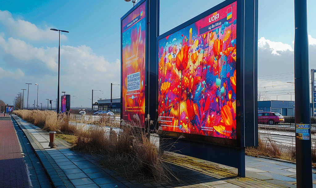
Creative B – Motion and Contrast Priority
Screen two abandoned traditional design rules. Every element moved. We used high-contrast backgrounds (black with white and yellow text). Content changed every 3-4 seconds, timed to walking speed.
No product glamour shots. Instead, we showed simplified animations, expanding circles, sliding text, and directional arrows. Each screen communicated one concept using a maximum of seven words.
The luminance contrast ratio hit 85%. Motion elements appeared in the peripheral vision range, triggering that orienting response before pedestrians reached optimal viewing distance.
Performance metrics for Creative B:
- Average glance duration: 2.8 seconds
- Pedestrians who stopped: 11% of total foot traffic
- Average dwell time (for those who stopped): 7.3 seconds
- Total impressions captured: 8,192 over 14 days
Creative B pulled 267% more stopping behavior and held attention 78% longer. The AI analytics tracked head orientation. Creative B caused more full head turns (not peripheral glances) by a factor of 4.2x.
What the Data Actually Tells You
Screen placement was identical. Foot traffic patterns matched within 5% variance. Time of day, weather conditions, and competing visual stimuli remained constant. The only variable that changed was creative execution.
The winning approach contradicted conventional branding wisdom. It looked “less professional” in isolation but performed better in the street environment. Your conference room doesn’t replicate sidewalk conditions; what looks good on a laptop often fails in urban chaos.
The gap widened during high-traffic hours. Between noon and 2 PM, Creative A’s performance dropped 40% as cognitive load increased. Creative B maintained consistent engagement, suggesting that simplicity scales better under attention scarcity.
Message Timing Controls Who Sees What
Showing the right content at the wrong moment kills engagement faster than bad creative. We tested timing variables across the same Seattle location using different rotation speeds and transition methods.
The Three-Second Rule
Pedestrians move at 4-5 feet per second on average. At this pace, someone approaches your screen, enters the engagement zone, and exits within 6-8 seconds total. Your content rotation needs to match this biological constraint.
We tested five different timing patterns on the same display. Each ran for 48 hours with consistent foot traffic conditions.
| Rotation Speed | Stop Rate | Avg Dwell Time | Message Completion |
| 2 seconds | 4% | 2.1 sec | 22% |
| 3-4 seconds | 12% | 5.8 sec | 71% |
| 6 seconds | 9% | 4.9 sec | 58% |
| 8 seconds | 6% | 3.2 sec | 41% |
| 10+ seconds | 3% | 2.4 sec | 19% |
The sweet spot landed at 3-4 seconds per message. Fast enough to create urgency but slow enough for comprehension. Anything quicker felt frantic. Longer rotations meant pedestrians saw partial messages as they walked past.
Sync Your Content to Walking Speed
Smart timing accounts for approach distance. Someone spots your screen from 30 feet away and takes 6 seconds to reach optimal viewing range. If your content rotates every 8 seconds, they might catch the tail end of one message and miss the beginning of the next.
Timing optimization for street-level engagement:
- Start new content when pedestrians enter the 25-foot approach zone
- Hold key messages for 3-4 seconds minimum
- Use transition animations under 0.5 seconds (hard cuts work better than slow fades)
- Loop content every 12-15 seconds to catch repeat viewers
We added motion sensors to trigger content resets when new pedestrians entered the engagement zone. Stop rates jumped from 11% to 19% with this single modification. The screen “knew” when to start its sequence based on foot traffic patterns.
Rush Hour Destroys Complex Messages
Timing strategies shift based on pedestrian density. During low-traffic periods, you can run longer content sequences. When sidewalks get crowded, attention spans collapse.
- Morning rush (7-9 AM) sees people moving 30% faster with eyes locked on destinations.
- Lunch crowds (12-2 PM) move more slowly but carry a higher cognitive load.
- Evening foot traffic (5-7 PM) creates optimal conditions for moderate pace, discretionary attention, and higher entertainment receptivity.
We tested identical content at different times and watched engagement metrics swing wildly. The same creative that earned 15% stop rates at 6 PM pulled only 4% at 8 AM. Message timing needs to flex with audience behavior patterns, not run on static loops.
The Street Attention Framework You Can Use Tomorrow
This framework distills everything we tested into a repeatable system. You can apply these principles to any outdoor display regardless of industry, location, or budget.
The Four-Layer Attention Stack
Building effective street content requires layering four elements in the correct sequence. Miss one layer and your engagement rates tank.
The world of street-level advertising operates differently from digital platforms. Online platforms use push notifications and commodify attention through algorithms that track user behavior. Most people encounter hundreds of digital ads daily through the internet, but sidewalk displays compete for attention in physical space, where the rules shift completely.
From a historical perspective, outdoor advertising predates digital marketing by centuries, yet modern displays now bridge both worlds, combining physical presence with digital flexibility.
- Layer 1 – Peripheral Trigger: Get noticed before the viewer reaches your screen. Motion in the outer 20 feet of the approach distance activates peripheral vision. Use expanding shapes, directional movement, or high-contrast elements that catch the eye before conscious evaluation begins.
- Layer 2 – Orientation Lock: Once you trigger the glance, you have 0.8 seconds to justify continued attention. This layer needs maximum luminance contrast and a clear visual hierarchy. One dominant element should command 60% of screen space everything else supports it.
- Layer 3 – Message Delivery: You earned the attention. Now communicate something worth remembering. Single concept, maximum seven words, processed in 2-3 seconds. Skip clever wordplay. State the benefit directly.
- Layer 4 – Action Prompt: Tell viewers what to do next. “Scan QR code,” “Walk in now,” or “Visit [website]” work better than abstract calls to action. Make the next step obvious and friction-free.
Content Creation Checklist
Run every piece of content through this filter before publishing to your street-level displays. One failed criterion means the content underperforms. Street displays don’t have the ability to retarget viewers like digital ads can. You get one shot. Society has grown skeptical of advertising that screams for attention all the time, which means your content needs to earn engagement rather than demand it.
Businesses that generate profit from physical locations need access to frameworks that actually work in urban environments, not theories that sound good in marketing meetings.
- Does motion appear in the first 0.5 seconds?
- Can someone read the message while walking at normal speed?
- Does luminance contrast exceed 70%?
- Would this trigger attention in your peripheral vision?
- Can you summarize the message in five words or fewer?
- Does the content work without sound?
Timing Your Content Rotation
Map your content sequence to pedestrian flow patterns. Most businesses run the same loop all day and wonder why engagement fluctuates wildly.
Understanding timing saves you money and improves results. For example, running the same creative during morning rush and evening leisure hours ignores how viewer interests shift throughout the day. All the things that work at 6 PM might fail completely at 8 AM when pedestrians move faster and care less about brand storytelling.
| Time Block | Pedestrian Behavior | Optimal Rotation | Content Type |
| 7-9 AM | Fast pace, destination-focused | 2-3 seconds | Single benefit, bold text |
| 10 AM-12 PM | Moderate pace, browsing | 4-5 seconds | Product showcase, simple animation |
| 12-2 PM | High density, distracted | 3 seconds | High contrast, minimal text |
| 2-5 PM | Mixed pace, lower traffic | 5-6 seconds | Detailed offers, longer messages |
| 5-8 PM | Leisurely, entertainment-seeking | 4-5 seconds | Lifestyle imagery, brand storytelling |
Adjust these windows based on your actual foot traffic data. A business district follows different patterns than a shopping corridor or restaurant row.
Test, Measure, Adjust
The framework works when you close the feedback loop. Install basic analytics to track what performs. You don’t need expensive AI systems; manual counts during peak hours reveal patterns.
Track three metrics weekly. Stop rate (percentage of pedestrians who pause), dwell time (how long they stay), and conversion indicators (QR scans, foot traffic into your location, or website visits during display hours).
Change one variable at a time. Test motion speed one week, luminance contrast the next, and message timing after that. Measure the delta. Keep what works and kill what doesn’t.
Your Indoor Content Dies on Sidewalks
Most street-level displays fail because businesses repurpose indoor marketing materials. What works in a controlled environment collapses under street conditions.
The Indoor Assumptions That Kill Engagement
Conference rooms and shopping malls create ideal viewing conditions. Controlled lighting, stationary audiences, minimal distractions. Your brain has bandwidth to process complex messages. Streets operate under opposite conditions. Harsh sunlight, moving viewers, competing stimuli from every direction. Content designed for one environment rarely survives translation to the other.
The modern attention economy operates on different rules than traditional advertising. Tech companies spent decades perfecting ways to capture users’ attention through digital feeds and social media apps, generating billions in global net advertising revenue.
But the digital economy thrives on stationary viewers, human beings sitting with phones, not walking past storefronts. Your sidewalk screen competes against the digital universe in someone’s pocket, which means you need to understand human nature and how people allocate their own attention in modern life.
Common indoor-to-outdoor failures:
- Pastel color schemes that vanish in daylight
- Multi-paragraph text blocks that require 10+ seconds to read
- Subtle animations that get lost in urban visual noise
- Brand-first messaging that assumes viewer familiarity
- Vertical layouts that don’t match horizontal walking sightlines
We tracked 40 retail locations that moved their indoor content straight to storefront screens. Average engagement time measured 1.1 seconds. After converting the same content using street-optimized principles, engagement jumped to 4.7 seconds, a 327% improvement from the same creative brief.
The shift from indoor to outdoor requires critical thinking about what truly makes sense for moving audiences. Since the industrial revolution, businesses have adapted to new environments and technologies. The digital age demands the same way of thinking, just that now attention functions as a valuable currency in the modern economy.
Street-level displays can’t rely on the constant scrolling behavior that dominates screen time indoors. Young people especially filter out advertising noise, having grown up navigating the digital divide between authentic content and commercial messages.
The Readability Crisis
Text size that works indoors becomes invisible outdoors. Distance and viewing angle create geometry problems most designers ignore. A pedestrian walking past your storefront views the screen at angles between 30-60 degrees for most of their approach. At these angles, text height needs to increase by 40% compared to straight-on viewing to maintain readability.
The information creates different cognitive demands when viewers move past screens versus sit in front of them. Data scientists tracking eye movements in urban environments found that the huge effect of walking speed on comprehension gets ignored by most content creators.
Attention becomes a valuable resource on sidewalks where meaningful relationships between viewer and content must form in under three seconds. The capitalist economy rewards displays that pay attention to these constraints, while the global economy increasingly depends on physical retail cutting through digital noise.
Outdoor text sizing requirements:
- Minimum font height of 1/10th the viewing distance (10-foot distance = 12-inch letters minimum)
- Sans-serif fonts only (serifs disappear at distance and angle)
- Font weight at 700+ (regular weight looks anemic outdoors)
- Letter spacing increased 15-20% for moving audiences
Fix Your Content in Five Steps
You don’t need to rebuild everything from scratch. Most indoor content can adapt to street conditions with targeted modifications.
- Step 1 – Strip your message down to one core benefit. Cut everything else.
- Step 2 – Increase your contrast ratio. Convert backgrounds to pure black or pure white.
- Step 3 – Add motion to your static elements. Even simple slide-ins trigger better engagement.
- Step 4 – Reduce your text by 60%. If you have 20 words, cut to 7.
- Step 5 – Test your content on your phone in bright sunlight. If you can’t read it clearly, sidewalk audiences won’t either.
The gap between indoor and outdoor content performance isn’t subtle. We measured it across dozens of installations. Businesses running optimized street content see 4-6x higher engagement compared to repurposed indoor materials. The creative effort required for optimization takes 2-3 hours. The performance delta lasts for months.
The Technical Foundation for Street-Level Performance
Optimizing your content only matters if your software and hardware can display it properly.
- CrownTV’s digital signage software handles the heavy lifting of content scheduling, rotation timing, and remote management across multiple locations. You can adjust your message timing from a central dashboard without touching individual screens.
- CrownTV’s media players deliver the brightness and processing power that street conditions demand. These compact units push 4K content at the frame rates needed for smooth motion graphics, the kind that triggers peripheral vision from 25 feet away. Reliability matters when your screen sits in a storefront 12 hours per day. Equipment failures during peak hours cost you the exact engagement windows we’ve spent this entire article optimizing for.
- Building content that follows the Street Attention Framework becomes simpler when you tap into pre-built applications designed for commercial displays. Weather widgets, social media feeds, and live data integrations add the motion and real-time updates that keep content fresh without constant manual intervention. A static restaurant menu gets ignored. That same menu with live wait times and rotating daily specials triggers the novelty response we covered in the neuroscience section.
- Professional installation removes the technical barriers between strategy and execution. CrownTV’s installation services handle screen mounting at optimal heights and angles for sidewalk viewing, cable management that survives weather exposure, and brightness calibration based on your specific street conditions. You get expert recommendations on screen placement based on pedestrian flow analysis, the difference between a display that catches attention and one that pedestrians walk past because the viewing angle creates glare.
Businesses across the US use this combination of optimized content strategy and reliable infrastructure to pull attention away from smartphones and back to their storefronts. Your creative direction sets the strategy. The technical foundation makes sure that the strategy actually reaches your audience at the moments when they’re walking past your location.
Street-Level Screens Need Street-Level Strategy
You now understand why most storefront displays fail. They’re built on indoor assumptions, tested in conference rooms, and deployed into street chaos without accounting for walking speed, sunlight, or the 250-millisecond attention filter.
The businesses winning attention on sidewalks aren’t running prettier content. They’re running different content. Here’s what separates displays that get noticed from expensive digital wallpaper:
- Motion triggers peripheral vision before conscious evaluation begins. Static screens lose to movement every single time, regardless of creative quality or brand recognition
- Luminance contrast above 70% cuts through urban visual noise; your color palette matters less than the brightness differential between elements on screen
- 3-4 second message timing matches pedestrian walking speed. Longer rotations mean viewers catch partial messages and walk away confused or uninterested
- Seven words maximum per screen, moving audiences can’t process complexity, so strip messages down to single benefits stated clearly
- Time-of-day content strategy doubles engagement rates. What works at 8 AM fails at 6 PM because pedestrian behavior shifts throughout the day
The framework works. We tested it. The data shows stop rates jumping from 3% to 19% when you align content with how the human brain actually processes information while moving through urban environments.CrownTV’s platform handles the technical execution of these principles across single locations or nationwide deployments. The dashboard lets you schedule content rotations based on foot traffic patterns, the media players deliver the brightness street conditions demand, and the installation team positions screens at angles that maximize visibility without glare. You’ve got the strategy now. The infrastructure exists to make it work at scale.