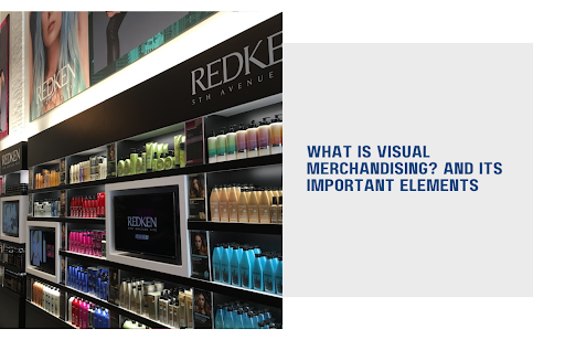
In this guide, we explore everything you need to know about what is visual merchandising? definition & key elements and how it can transform your business communications.
You’ve got great products. Your prices are competitive. But customers walk right past your store like it’s invisible. The difference between a thriving retail space and an empty one often comes down to something you can’t list on a price tag: visual merchandising. It’s the silent salesperson working 24/7 to pull shoppers in, guide their eyes to high-margin items, and turn browsers into buyers. Most retailers know they need it. Few know how to execute it well.
Poor visual merchandising costs you sales every single day. Cluttered displays confuse customers. Bad lighting kills the mood. Inconsistent branding makes you forgettable. And in a world where shoppers decide in 3 seconds if they’ll enter your store, you can’t afford to get this wrong.
We’ll break the mystery down and show you exactly how to use visual merchandising to transform your retail space into a revenue-generating machine.
Here’s what you’ll learn:
- What visual merchandising actually is and why it goes far beyond “making things look pretty”
- Why visual styling matters for your bottom line and customer experience
- The core elements that make visual merchandising work (and how to apply them to your store)
Let’s turn your retail space into something shoppers can’t resist.
What is Visual Merchandising? Definition & Key Elements: Visual Merchandising Goes Beyond Window Dressing
Visual merchandising is the strategic practice of designing and arranging products, displays, and store environments to maximize sales and create memorable shopping experiences. It combines psychology, design principles, and retail strategy to influence customer behavior from the moment they spot your storefront.
This isn’t about making things “look nice.” It’s about engineering an environment that guides customers through a carefully planned path, highlights your most profitable products, and triggers the emotional responses that lead to purchases. Every color choice, every product placement, every lighting angle serves a specific business purpose.
Where Visual Merchandising Started
Visual merchandising has roots that stretch back further than most retailers realize. The practice gained serious momentum in the late 1800s when department stores like Macy’s and Marshall Field’s began creating elaborate window displays to attract foot traffic. These early pioneers understood something critical: presentation sells products as much as the products themselves.
The 1960s brought a major shift. Retailers moved from purely decorative displays to psychologically informed arrangements. They started asking questions like “Where do customers naturally look first?” and “Which colors make people want to buy?” The practice evolved from art into science.
Today’s visual merchandising blends those historical principles with modern technology and data. Retailers now track eye movements, analyze customer flow patterns, and test different layouts to optimize every square foot of space. The goal remains the same as it was 150 years ago: get customers in the door and guide them toward a purchase, but the execution has become far more sophisticated.
The modern approach includes:
- Strategic product placement based on customer behavior patterns
- Color psychology to trigger specific emotional responses
- Lighting techniques that highlight products and create ambiance
- Signage systems that inform without overwhelming
- Store layouts are designed to maximize exposure to high-margin items
You’re not decorating a space. You’re building a sales tool that works around the clock to convert foot traffic into revenue.
Why Visual Styling Drives Revenue and Loyalty
Visual merchandising directly impacts your store’s financial performance and customer relationships. It’s the difference between a shopper who glances and leaves versus one who stays, explores, and buys. When you get visual styling right, you create a compound effect that touches every part of your retail operation. Retail success starts with understanding how visual elements work together to create environments that sell.
Strategic Displays Pull More Customers Inside
Your storefront and window displays serve as your first and sometimes only chance to convert passersby into store visitors. Visual merchandising displays act like a magnet, stopping people mid-stride and pulling them toward your entrance. While online visual merchandising has its place in e-commerce, physical stores need compelling in-store displays that command attention in person.
What makes displays work:
- Eye-level focal points that catch attention from 10-15 feet away
- Movement and contrast that break through visual noise
- Clear value proposition visible within 3 seconds of glancing
- Seasonal relevance that creates urgency and timeliness
The key is creating displays that answer the unspoken question every passerby asks: “Why should I care?” You need to show them something they want, need, or didn’t know they were missing. Seasonal displays keep your storefront fresh and give repeat customers new reasons to come back in.
Visual merchandisers understand that combining dark and light tones creates the contrast needed to make featured products pop against the background.
Converting Browsers Into Buyers Gets Easier
Visual merchandising transforms casual shoppers into paying customers by removing friction from the buying process. Smart product placement, clear pricing displays, and logical category grouping all work together to make purchasing feel natural and effortless. Effective visual merchandising can boost sales by creating clear paths to purchase.
Here’s how different techniques drive conversions:
| Technique | How It Increases Sales |
| Cross-merchandising | Places complementary products together, suggesting complete outfits or solutions |
| Power walls | Creates high-impact vertical displays at eye level for featured items |
| End caps | Captures attention at aisle ends with promotional or high-margin products |
| Impulse zones | Position small, affordable items near checkout for last-minute additions |
You can also use color blocking to organize products by shade, making it easier for customers to find what they want while creating visually striking displays. The faster someone finds their preferred item, the more likely they’ll complete the purchase. Interactive displays that encourage touching and engagement increase purchase likelihood even further.
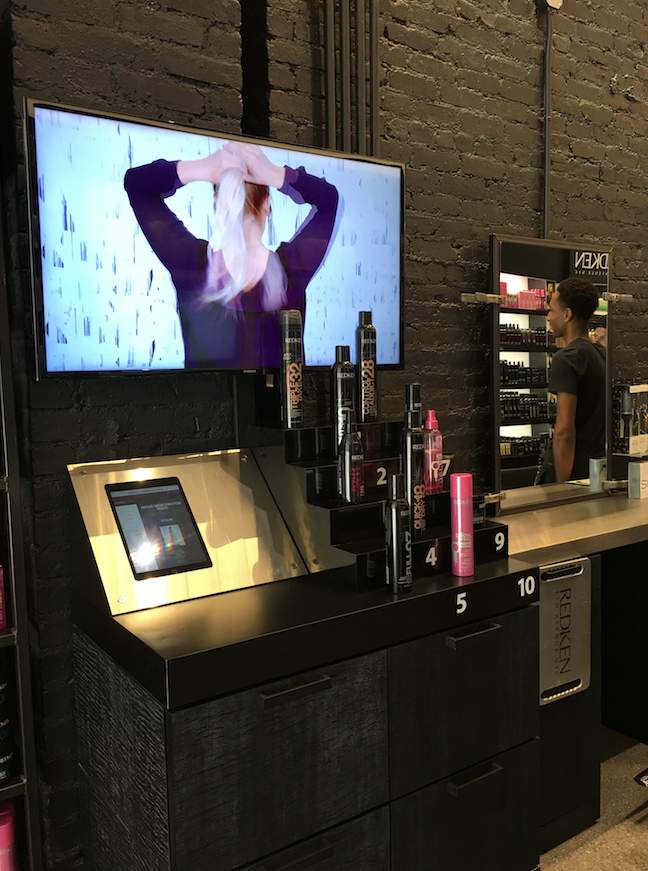
Modern retail visual merchandising often incorporates digital screens to showcase product demos, customer testimonials, or visual marketing content that reinforces your brand message.
Customer Experience Improves Through Thoughtful Design
A well-merchandised store makes shopping feel effortless and enjoyable. Customers shouldn’t have to hunt for products, decipher confusing layouts, or squint at poorly lit displays. The environment should guide them naturally through your space while building positive associations with your brand. Smart in-store visual display strategies create these seamless experiences.
Experience-building elements include:
- Intuitive wayfinding through strategic signage and product grouping
- Comfortable browsing zones with adequate space between displays
- Sensory engagement through lighting, music, and even scent
- Clear information hierarchy that answers questions before they’re asked
When customers feel comfortable and oriented in your space, they spend more time browsing. More time browsing means more opportunities to connect with products and make purchases. The experience becomes self-reinforcing. Applying visual merchandising best practices and following proven visual merchandising tips helps you create these customer-friendly environments consistently.
Building Long-Term Brand Loyalty Through Consistency
Visual merchandising creates brand recognition that extends far beyond a single shopping trip. Consistent styling across all touchpoints, from window displays to product arrangements to signage, builds trust and familiarity. Customers start associating certain visual cues with your brand’s quality and values. The elements of visual merchandising work together to encourage brand loyalty retailers can count on for long-term growth.
Loyalty-building tactics:
- Signature color schemes that become instantly recognizable
- Consistent fixture styling that maintains brand identity across locations
- Predictable store layouts that make repeat visits feel familiar
- Seasonal refresh cycles that reward repeat customers with newness
A customer who knows what to expect from your visual presentation becomes a customer who seeks you out specifically. They’re not shopping at a generic store. They’re shopping at your store because they trust the experience you provide. Strong visual merchandising directly impacts retail sales by creating the kind of memorable experiences that turn first-time visitors into regular customers.
Setting Your Store Apart From Competitors
In a crowded retail market, visual merchandising becomes your competitive advantage. Two stores can sell identical products at similar prices, but the one with superior visual presentation wins the customer. Your displays, lighting, and overall aesthetic communicate professionalism and attention to detail before a single word is spoken.
You’re telling customers through pure visual language that you care about quality, that you understand their needs, and that shopping with you will be worth their time. Competitors who neglect visual merchandising leave money on the table and customers feeling uninspired.
Key differentiators:
- Unique display concepts that reflect your brand personality
- Premium presentation that justifies higher price points
- Interactive elements that encourage engagement and social sharing
- Professional execution that signals operational excellence
The stores that master visual merchandising don’t compete on price alone. They compete on experience, and that’s a game you can win regardless of your size or budget.
The Core Elements That Make Visual Merchandising Work
Visual merchandising succeeds or fails based on how well you execute its fundamental elements. Each component plays a specific role in creating an environment that attracts customers, showcases products, and drives sales.
Master these visual merchandising elements, and you’ll have full control over your retail environment’s performance. Good visual merchandising requires understanding how all design elements work together to create a cohesive shopping environment.
Color Psychology Influences Buying Behavior
Color choices trigger specific emotional responses and purchasing decisions. Different hues create different moods, guide customer attention, and even influence how long shoppers stay in your store. You’re not picking colors because they look good together. You’re selecting them because they drive specific outcomes and enhance customer experience at every touchpoint.
How colors affect shopping behavior:
| Color | Psychological Effect | Best Use Cases |
| Red | Creates urgency and excitement | Sale signage, clearance sections, impulse buy zones |
| Blue | Builds trust and calm | Professional services, high-ticket items, checkout areas |
| Yellow | Grabs attention and energizes | Window displays, promotional signs, youth products |
| Green | Suggests health and sustainability | Organic products, wellness items, and eco-friendly brands |
| Black | Conveys luxury and sophistication | Premium products, high-end displays, exclusive collections |
| Orange | Encourages action and enthusiasm | Call-to-action signs, seasonal promotions, sports merchandise |
You should also consider color blocking strategies that group similar shades together. This creates visual impact while making it easier for customers to find products. Contrasting colors work well for highlighting featured items or directing attention to specific areas. Your color choices directly impact your brand’s image and how customers perceive quality across your entire customer journey.
Layout Design Controls Customer Flow
Store layout determines how customers move through your space and which products they encounter. A strategic floor plan guides shoppers past high-margin items, creates natural browsing patterns, and maximizes exposure to your full product range. Smart store design considers both function and psychology to create paths that feel natural while maximizing revenue potential.
Common layout strategies include:
- Grid layout for maximum product display and easy navigation (grocery stores, pharmacies)
- Loop layout that guides customers through a predetermined path (IKEA-style)
- Free-flow layout for relaxed browsing and discovery (boutiques, gift shops)
- Spine layout with a main aisle and branching sections (department stores)
The decompression zone at your entrance deserves special attention. This is where customers transition from outside to inside, adjusting to your store environment. Avoid placing critical products or signage in this area. Give shoppers 5-10 feet to orient themselves before hitting them with your main displays. You don’t want to risk making customers wait or feel overwhelmed the moment they enter.
Your layout should also account for traffic patterns. Most shoppers naturally turn right when entering a store and move counterclockwise. Place your highest-margin or featured products along this natural path. A clothing store might position featured collections on the right wall, while other retail formats adapt this principle to their specific needs. The goal is to create an immersive shopping experience that feels intuitive rather than forced.
Lighting Sets Mood and Highlights Products
Lighting does more than make products visible. It creates atmosphere, directs attention, and influences how customers perceive quality and value. Poor lighting makes everything look cheap. Strategic lighting makes products irresistible. A proper light control system gives you full command over your store’s ambiance and product presentation.
You need multiple lighting layers working together:
- Ambient lighting provides overall illumination and sets the base mood
- Task lighting brightens specific work areas like checkout counters
- Accent lighting highlights featured products and creates focal points
- Decorative lighting adds personality and reinforces brand aesthetic
Pro tip: Use lighting contrast to guide eyes toward high-priority items. A well-lit display against a dimmer background naturally draws attention. Spotlights on featured products create a “stage effect” that suggests importance and value. This is one of the most powerful merchandising techniques available because it works subconsciously.
Color temperature matters too.
- Warm lighting (2700-3000K) creates a cozy, inviting feel perfect for clothing and home goods.
- Cool lighting (4000-5000K) works better for electronics and professional products where clarity matters more than warmth.
Getting this right builds customer loyalty by creating environments people want to return to.
Strategic Space Management Maximizes Impact
How you use vertical and horizontal space determines how many products you can display and how effectively you can showcase them. Empty space isn’t wasted space. It’s breathing room that prevents visual clutter and allows key items to stand out. Effective merchandising involves knowing when to fill space and when to leave it empty.
Space allocation principles:
| Zone | Purpose | Best Practices |
| Eye level | Prime selling space | Feature high-margin and best-selling items |
| Above eye level | Brand building | Display logos, aspirational products, decorative elements |
| Waist to eye level | Secondary selling | Place complementary items and mid-range products |
| Below waist | Bulk and basics | Stock everyday items, large packages, and children’s products |
You should follow the rule of three when creating displays. Group products in odd numbers (3, 5, 7) rather than even numbers. Odd groupings create visual interest and feel more natural to the eye. How you arrange display racks matters as much as what you put on them.
Negative space around key products prevents displays from looking cluttered and overwhelming. Give featured items room to breathe. Customers need to process what they’re seeing before deciding to engage. This approach to displaying products respects customer preferences for clean, easy-to-navigate spaces.
Signage Communicates Without Overwhelming
Effective signage informs, guides, and persuades without cluttering your visual field. Every sign should serve a clear purpose: directing traffic, explaining product benefits, highlighting promotions, or reinforcing brand identity. Well-executed store signage becomes part of your overall marketing strategy rather than an afterthought.
Your signage hierarchy needs three levels:
- Primary signs for major categories and wayfinding (large, high-contrast)
- Secondary signs for subcategories and product groups (medium-sized, supporting)
- Tertiary signs for product details and pricing (small, functional)
Signage best practices:
- Keep messaging to 7 words or fewer for maximum impact
- Use high-contrast color combinations for readability
- Place signs at consistent heights throughout the store
- Update promotional signage regularly to maintain freshness
- Test readability from typical customer viewing distances
Digital signage offers unique advantages over static signs. You can update messages instantly, rotate multiple promotions throughout the day, and display dynamic content that captures attention. Digital displays also reduce printing costs and allow you to test different messages to see what resonates.
They create a digital environment within your physical space that bridges the gap between in-store and online shopping experiences. Using attractive signage with customer-focused content increases customer engagement and drives action.
Storytelling Creates Emotional Connections
Products tell stories when you display them correctly. A mannequin wearing a complete outfit tells the story of a night out. A kitchen display with cooking tools and ingredients tells the story of a home-cooked meal. These narratives help customers picture themselves using your products and communicate your unique brand message through visual context.
Story-building techniques include:
- Lifestyle vignettes that show products in context
- Thematic displays tied to seasons, holidays, or cultural moments
- Sequential arrangements that suggest progression or transformation
- Complementary grouping that shows how products work together
The story you’re telling should align with your target customer’s aspirations and lifestyle. A discount retailer tells different stories than a luxury boutique. Match your visual narrative to your audience’s values and desires. Using seasonal themes keeps your storytelling fresh and relevant throughout the year. These narratives capture customer interest and make shopping feel like an experience rather than a transaction.
Focal Points Direct Customer Attention
Every display needs a clear focal point that immediately captures attention and anchors the entire composition. Your eye should land somewhere specific, not wander aimlessly across the display. Create these focal points through size, color, lighting, or positioning. This is how retailers create displays that actually convert browsers into buyers.
Focal point strategies:
- Pyramidal arrangements with the hero product at the apex
- Repetition patterns broken by a single standout item
- Diagonal lines that naturally guide eyes toward featured products
- Elevated platforms that literally raise important items above the rest
You can have multiple focal points in a large store, but each individual display should have only one primary focus. Too many competing elements create visual confusion and dilute your message. A consistent visual experience across all displays helps build customer loyalty by creating familiarity and trust. Understanding focal points and other elements of composition separates amateur displays from professional ones.
Texture and Materials Add Dimension
Texture creates visual interest and encourages touching, which increases purchase likelihood. Different materials signal different product qualities and price points. Smooth, polished surfaces suggest luxury. Rough, natural textures suggest authenticity and craftsmanship.
Mix textures strategically:
- Combine matte and glossy finishes
- Pair soft fabrics with hard surfaces
- Layer smooth metals with rough wood
- Contrast natural materials with modern elements
Interactive texture invites customers to engage physically with displays. Touchable fabrics, textured surfaces, and materials that respond to handling all encourage the kind of physical interaction that leads to purchases. Once someone picks something up, they’re halfway to buying it.
Closing Thoughts
You now have the framework for transforming your retail space into a revenue-generating machine. Visual merchandising isn’t decoration. It’s strategic design that guides customer behavior, builds brand loyalty, and separates you from competitors who still treat their stores like warehouses with price tags.
Here’s what you can accomplish when you put these elements into action:
- Pull more qualified traffic through strategic window displays and color psychology that stops passersby mid-stride and gives them a reason to walk through your door
- Increase average transaction values by using cross-merchandising, power walls, and impulse zones that naturally suggest complementary purchases customers didn’t know they needed
- Reduce customer friction through intuitive layouts, proper lighting, and clear wayfinding that makes shopping feel effortless instead of confusing
- Build lasting brand recognition with consistent styling, signature color schemes, and storytelling displays that turn one-time shoppers into loyal repeat customers
- Maximize every square foot by applying space management principles that showcase high-margin items at eye level while maintaining the breathing room that prevents visual clutter
Digital signage ties all these elements together. You can update your messaging instantly, rotate promotions based on time of day, and test different visual approaches without reprinting a single sign. CrownTV makes this simple with a cloud-based dashboard that manages screens across single or multiple locations.The platform includes hundreds of app integrations, so you can display social feeds, customer reviews, or dynamic product showcases alongside traditional signage. You get the hardware, software, and support needed to keep your visual merchandising strategy current without the hassle of managing multiple vendors or complex technical setups.