In this guide, we explore everything you need to know about reception digital signage ideas and how it can transform your business communications.
Your office reception signage is the first thing visitors see when they walk through your door, and most companies waste this opportunity completely. A blank screen, an outdated poster, or a generic “Welcome” slide does nothing for your brand. In 2026, smart businesses are using reception screens as active tools to impress clients, streamline check-ins, reinforce brand identity, and improve internal communication.
The good news: you don’t need a major renovation or a big IT budget to upgrade your reception area. With the right digital signage solution, you can transform your welcome area into a dynamic, professional first impression that works around the clock. We’ve compiled 10 proven office reception signage ideas that leading companies are using right now.
We’ll break the ideas down, show you what works, and show you how to get those screens to actually work for you.
Here’s what we’ll cover:
- Digital welcome messages that greet and guide
- Branded motion loops that hold the room
- Live directories that keep traffic flowing
- QR-led touchpoints for frictionless sign-ins
- Social walls to bring your team’s energy forward
- Spotlight reels for clients, partners, or awards
- Internal news feeds to keep the culture up front
- Visitor metrics and wait-time boards
- Local weather + traffic modules with subtle branding
- Interactive FAQs or compliance-friendly safety info
You’re about to get ideas that pull the welcome area together—and push your brand forward.
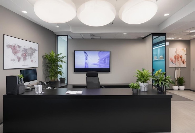
Reception Digital Signage Ideas: Make the Entrance Speak for You with Digital Welcome Messages
First impressions don’t happen twice. The second someone steps through your door, they start forming opinions about your professionalism, your culture, and your attention to detail. A well-placed digital welcome message helps you grab control of that moment without adding pressure to your front-desk staff.
When digital signage does the greeting, it builds structure into the experience. It tells people where they are, who they’re meeting, and what to expect next. It gets ahead of awkward confusion and sets the tone immediately.
Why It Works?
According to a report, digital signage captures 400% more views than static displays. That extra attention can translate into fewer check-in delays, smoother visitor flow, and a stronger brand presence from the start.
Companies with high visitor traffic—corporate offices, co-working spaces, multi-tenant buildings—use welcome screens to cut clutter and keep guests moving with purpose. These aren’t complicated systems. They’re simple text-based screens that rotate on schedule, often tied to calendar integrations or front desk systems.
Message Ideas That Actually Work
- “Welcome, RSM Consulting. Your meeting is in Room 214.”
- “Hello, interview candidates. Please check in at the tablet.”
- “We’re glad you’re here. WiFi: MainGuest | PW: Connect123”
- “Today’s events: 10 am | Board Meeting | Room 3A”
- “Deliveries? Head to Loading Dock B for drop-off.”
These messages do more than say hello—they answer questions before they’re asked.
Pro Tip
Tie your welcome signage to a scheduling tool like Google Calendar, Envoy, or Teem. Automated messages that update themselves don’t need daily attention, and they always feel current. If your building gets a steady stream of clients, vendors, or applicants, digital greetings give your staff room to focus and let the screen pick the small talk up.
Let Branded Motion Loops Set the Tone from the Start
While the front desk handles logistics, the screen behind it can do something more strategic—hold attention. A branded motion loop plays in the background and works like visual glue. It pulls the space together and gives people something intentional to look at while they wait.
These loops aren’t ads. They’re short, silent animations built around your visual identity. Logos that animate in cleanly. Taglines that glide across the screen. Subtle motion that stays in rhythm with the pace of the room.
What to Include in a Branded Loop
- Your logo, animated with clean transitions
- A tagline or mission statement in motion
- Brand colors used in motion-based shapes or transitions
- Soft-textured animations (no harsh flashes or jump cuts)
- Rotating value props or pillars that reinforce what you do
Keep the loop short—20 to 30 seconds max—so it cycles often without losing clarity. Aim for visuals that support your environment without overpowering it.
Design Tip
Mute the color palette. Soft gradients or matte tones tend to work better in reception areas where people linger. High-contrast elements work well for short-term impact, but motion loops should hold attention over time, not compete for it.
Done well, a branded motion loop adds polish without needing sound, copy, or context. It turns wall space into a living brand marker.
Keep People Moving with Live Directories That Work on Cue
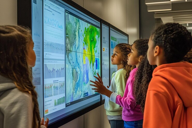
Reception areas often bottleneck because visitors stop to ask basic questions—where to go, whom to meet, which floor to take. A live directory takes that friction out of the equation by laying the information out clearly, right where it’s needed.
Digital directories do more than display names and suite numbers. They can update on the fly, reflect daily changes, and support large or multi-tenant spaces without static printouts. When visitors see their destination the moment they walk in, they stop hovering and start walking.
What a Smart Directory Should Display
- Company names and their office locations
- Current meetings or scheduled events
- Staff availability for visitor drop-ins
- Floor maps or zone highlights
- Contactless check-in instructions
Most offices rotate content automatically based on calendar data or internal check-in systems. A screen in portrait mode near the entrance works best—close enough to read, far enough to avoid crowding.
Choose a screen with vertical orientation for multi-floor layouts. It gives you more room to stack entries and match the visual layout to the building structure. That small shift can help visitors spot their destination without stopping traffic behind them.
Streamline the Entry Process with QR-Led Touchpoints
Manual check-ins slow the front desk down and pull staff into repetitive tasks. QR-led sign-in stations are clear that out of the way. They put control in the visitor’s hands—literally.
With a single scan, guests can pull the sign-in form up on their phones, fill out the required fields, and move through the process without touching a shared device. From a technical standpoint, this setup depends on four elements working together:
1. Display Hardware That Presents the QR Clearly
The success of a QR-led sign-in depends heavily on the display’s hardware specs. The QR code must be crystal-clear at a reasonable viewing distance—typically 4 to 7 feet. Anything less, and you risk scan failures, glare issues, or user frustration.
Use screens with at least 1920×1080 (Full HD) resolution. For larger lobbies or bright environments, 4K displays improve scannability by increasing the pixel count and rendering sharper vector-based codes.
Brightness matters too. Indoor lobby digital signage displays should support a minimum brightness of 350–500 nits. Anything lower becomes unreadable under direct lighting. For environments with floor-to-ceiling windows or strong overhead light, consider commercial-grade digital displays with anti-glare coating and 1,000+ nits brightness.
Orientation should also be considered. Mount the screen at eye-level in portrait mode to increase vertical space for the QR and supporting instructions. Avoid placing the QR too close to the top or bottom edge—it should sit in the top third of the display, sized at a minimum of 200×200 pixels, but preferably rendered at 300+ pixels for reliability across smartphone camera types.
2. Secure Back-End That Links the Code to a Live Form
The QR code must connect to a secure and responsive backend that supports real-time input processing and routes data into your visitor management system (VMS). The most stable architecture involves using a form-hosting platform with HTTPS encryption, custom field logic, and third-party webhook support.
Form engines like Typeform, Jotform Enterprise, or custom-built React.js / Vue.js frontends tied to Node.js or Laravel backends are common choices for high-security workflows.
Your form should support dynamic routing—detecting visitor intent (e.g., delivery, client meeting, contractor) and conditionally displaying fields based on that selection. To achieve this, implement conditional logic trees within the form engine or in the front-end JavaScript.
Every entry must be secured using OAuth 2.0 or token-based authentication, especially if the form allows internal access to building systems, staff calendars, or sensitive guest data. Submissions should be logged in real-time to a secure, audit-traceable database like PostgreSQL, Firebase, or MongoDB, depending on your stack.
For enterprise environments, make the form SSO-compliant with providers like Azure AD, Okta, or Google Workspace for internal employee check-ins.
3. Analytics Layer That Captures Activity
Capturing sign-in data goes far beyond timestamping a name. You should track behavioral metadata, volume metrics, and device-based interaction details, without violating privacy standards.
Every form submission should trigger an event log that includes:
- Timestamp (ISO 8601 format for consistency)
- Visitor type (client, vendor, applicant, etc.)
- Device type (iOS, Android, desktop fallback if applicable)
- QR scan success/failure (from embedded tracking pixels)
- Completion time (average time per entry, indicating user friction)
Use Google Analytics 4 (GA4) or Matomo for GDPR-compliant on-form tracking. Embed UTM parameters or event listeners in the QR code URL to segment traffic sources and feed data into a business intelligence dashboard (e.g., Power BI, Tableau, Looker Studio).
Set up webhook-based automation to send real-time alerts or entries to Slack, Microsoft Teams, or your visitor logbook via Zapier, Integromat (Make), or custom-built APIs. Maintain logs in structured JSON or CSV formats with daily rollups to cloud storage (AWS S3 or Google Cloud Storage) for compliance and recovery.
4. Fail-Safe Visual Cues
Even high-end tech hits snags. Fail-safes reduce drop-offs from failed scans, poor lighting, or incompatible devices. The digital sign should always offer a short fallback URL prominently beneath the QR code, ideally under 25 characters and hosted on a branded subdomain.
For accessibility, include:
- Readable font at a minimum 18pt size
- High contrast ratios (WCAG AA-compliant)—e.g., white text on black or dark gray background
- Text spacing of at least 1.5x line height
- Multilingual instructions if your office sees global traffic
Also, integrate visual feedback cues for confirmation. For instance:
- A “Scan successful” overlay for 2 seconds after interaction
- A subtle animation (e.g., pulsing checkmark or progress bar) to show that a form is loading
- A fallback touchscreen kiosk nearby for non-smartphone users or QR failures
Redundancy is about user trust. A smooth experience doesn’t assume tech will always work—it prepares for when it doesn’t, without breaking flow.
Put Team Culture on Display with Social Walls That Work
Corporate spaces often talk about culture, but few show it. A digital social wall flips that on its head by bringing real employee content into the room, where guests, clients, and partners can see the energy for themselves.
A social wall pulls live content from your team’s public-facing social media accounts and arranges it into a clean, branded feed. This isn’t about chasing likes—it’s about showing momentum. Highlighted posts might include team wins, office celebrations, recruiting events, or community outreach efforts. The point is to let your culture carry the screen without needing a script.
What to Feature on a Social Wall in the Reception Area?
1. Company-Owned Social Media Posts
Pull content directly from verified corporate accounts across platforms like LinkedIn, Instagram, X, and Facebook. These sources should use consistent image dimensions (1:1 or 16:9) and include:
- Announcements (e.g., mergers, openings, awards)
- Product releases or rollouts
- Event coverage or internal summits
- CEO or executive messages, if visually formatted
Use a content moderation tool to pre-approve or schedule these posts before they’re pushed to the wall. For compliance-sensitive environments (finance, pharma, government), integrate platform-specific API permissions (OAuth tokens) to control access and display frequency.
2. Curated Employee Content with Hashtag Filtering
Encourage staff to post using a unique internal hashtag (e.g., #InsideABC, #WorkAtXYZ) and display content that reflects your team’s voice. Recommended content types:
- Team celebrations and birthday shoutouts
- Department wins or KPIs reached
- Office upgrades, decor setups, or behind-the-scenes ops
The wall software must support hashtag-based scraping with whitelisting rules, enabling you to surface only posts tagged appropriately and posted from whitelisted user handles.
Apply pre-display filtering that strips out political or off-brand content by using sentiment scoring or AI keyword classifiers.
3. Event-Based Content (Live or Recap)
If your company hosts regular client summits, community drives, or hackathons, these moments can be repurposed into content blocks such as:
- Live tweets are displayed during on-site events
- Photo reels pulled from event hashtags
- Quote cards from keynote speakers
Enable a rolling schedule through event-based CMS rules, where content tagged with a specific date or metadata string (e.g., event_type: recruitment) appears during a pre-set time window and then expires automatically.
4. Department Spotlights and Internal Campaigns
Use scheduled slides to highlight different departments, rotating weekly or monthly. Each spotlight can include:
- Department name, mission, and lead photo
- Recent internal accomplishments
- Team photos or short intro videos
- Recruiting status or open roles (optional)
Pull content from your internal HRIS or comms database via API hooks or pre-exported content packages, formatted in standardized JSON or XML to map cleanly into the signage content engine.
5. CSR and DEI Content
Reception areas are high-stakes touchpoints for potential partners and talent. Showcasing your Corporate Social Responsibility (CSR) or Diversity, Equity & Inclusion (DEI) efforts can set the tone and trust immediately.
Content ideas include:
- Recaps of volunteer initiatives
- Diversity hiring milestones or internal ERG highlights
- Donations or non-profit partnerships
- Inclusion-centered event photos and quote graphics
Use pre-designed content tiles that follow strict design accessibility standards (e.g., WCAG 2.1 Level AA for contrast ratios and font size) to accommodate all viewers walking through reception.
6. Social Proof and Press Coverage
Display recent media mentions, press releases, or third-party recognition (e.g., “Top Place to Work,” industry leadership, sustainability rankings). Keep the formatting minimal:
- Clean logo or outlet watermark
- Headline and source
- Short 1-line summary or pull quote
Content should rotate no faster than one item every 15 seconds to allow full readability. Include clickable QR codes only if interaction is expected in that space.
7. Controlled UGC (User-Generated Content)
If your brand has a loyal customer base, especially in B2C environments, consider surfacing select customer posts—product photos, feedback snippets, or branded usage stories. Apply strict moderation rules:
- Only show tagged posts approved by the social team
- Remove geotags and usernames to preserve privacy
- Embed disclaimers or usage rights in internal documentation
Route this content through asset management platforms (e.g., Bynder, Brandfolder) where all approved assets are tracked with license metadata and expiration timelines.
Each element you feature should support your larger reception strategy—whether that’s hiring, selling, or reinforcing trust. Social walls are not billboards. They’re live narratives, designed to pull the hallway into the conversation.
Use Spotlight Reels to Bring Recognition into the Room
A well-positioned spotlight reel lets visitors see who you work with and what you’ve accomplished—without saying a word. Displaying trusted names, awards, and key partnerships at the reception builds instant credibility. It moves your reputation from a line on the website into something visual and immediate.
Spotlight reels typically rotate through pre-designed slides or short-form videos, each one focused on a single subject. Keep transitions smooth, silent, and timed for casual viewing. The goal isn’t to pitch—it’s to reinforce trust while people wait or pass through.
What to Feature in a Spotlight Reel
- Client logos (used with permission) paired with a one-line descriptor of your work together
- Partner shoutouts or technology integrations that support your operations
- Third-party awards or certifications for the relevant year or rank
- Event participation or speaking engagements at major industry venues
- Local impact initiatives—community work or sustainability projects with measurable outcomes
Stick to a consistent visual format. Every card or slide should follow the same structure: logo or name at the top, supporting detail in the middle, and a minimal visual cue (e.g., icon or ribbon) to frame the content.
Operational Tip
Batch spotlight assets in grouped sets by theme (e.g., awards, clients, events). Schedule them to rotate on a time-of-day or day-of-week cadence using your signage CMS. This keeps the content fresh and prevents fatigue from overexposure.
Let Internal News Feeds Keep Your Culture in Plain Sight
Reception signage doesn’t have to serve outsiders only. It can help keep teams informed and in sync—even before they swipe their badge.
Internal news feeds in the welcome area give your own people a subtle reminder of what’s moving forward. You’re not sending out another email blast or flooding a Slack channel. You’re putting the right updates in the right spot—where everyone passes through.
Here’s how to build that layer into your signage strategy:
- Start with Source Control: Pull from one reliable content source—preferably your internal comms team or intranet feed. Don’t overload the display with external news. Stick to internal wins, policy updates, or team highlights that actually matter. Structure the feed using an RSS or JSON endpoint that your signage CMS can ping every hour. Keep post length under 300 characters.
- Segment the Updates: Group content by intent. Use these categories to structure your loop:
- Announcements — policy changes, HR notices, major updates
- Wins — sales milestones, product launches, client feedback
- Culture — birthdays, work anniversaries, team photos
- Ops — space bookings, IT alerts, maintenance windows
This keeps the feed balanced and avoids letting one department dominate the screen.
- Design for Skimmability: Each post should be visual-first. Use an icon or image block on the left, a headline on the right, and an optional short line underneath. Avoid full-screen walls of text. Font weight, spacing, and visual grouping matter more than sheer screen size. Cycle each card every 10–15 seconds, depending on your foot traffic. Skip transitions with complex animations—load the next item clean, then let it sit. Reception is a transient zone. Make content feel calm, not rushed.
- Keep It Moving, But Not Noisy: Schedule the feed to refresh in the early morning, midday, and end-of-day. This gives your staff a reason to glance up on their way in or out. If your signage CMS allows tagging or labeling, group content by location so each office sees what’s most relevant to their floor or city.
Internal news doesn’t belong only in inboxes. When it runs across a screen in reception, it anchors your culture where it’s easy to notice—and hard to fake.
Turn Wait Time into Transparency with Live Visitor Metrics
People don’t mind waiting when they know what’s going on. Digital signage that displays live visitor metrics and estimated wait times can take uncertainty off the table, without anyone having to ask.
It’s not about showing off numbers. It’s about replacing guesswork with clarity.
Here’s how to build a metrics board that works for both guests and staff:
Define What You Want to Show
Start with the basics. Track and display key metrics that reflect the current reception status:
- Visitors currently checked in
- Estimated wait time
- Number of open appointments remaining today
- Meeting room availability
- Upcoming appointment names (first name or initials only, for privacy)
Use a secure API connection to pull this data from your visitor management system or scheduling software. Send updates to the display CMS on a rolling basis—ideally every 30 to 60 seconds to avoid screen flicker or server strain.
Set Display Rules for Privacy
Not everything belongs on a screen. Mask sensitive data by default. Never show full names, email addresses, or host names unless you’re operating in a closed internal environment. Use initials, time slots, or appointment codes instead.
If your VMS supports it, set visibility conditions so each visitor sees only what applies to them, like queue order or check-in confirmation.
Design the Metrics Interface with Hierarchy
Structure the board like an airport screen:
- Large, bold time indicators at the top
- Visual queue status in the middle
- Smaller, rotating footnotes or reminders at the bottom
Use neutral tones for base colors and highlight critical statuses (like “Now Serving” or “Delayed”) with soft motion or contrast shading—not blinking elements that distract or frustrate.
For touchless check-ins, display a confirmation block with the visitor’s check-in ID and approximate wait, so they can move to a seating area without guessing if they’re in line.
Log the Data Behind the Scenes
Set up a data layer that stores historical metrics. This allows reception teams to:
- Measure average wait times by day and hour
- Identify peak congestion zones
- Improve staff rotation or shift assignments
Push this data into a dashboarding tool or export it via CSV for reporting. Front-facing transparency gets stronger when backed by internal optimization.
Keep Visitors Informed with Local Weather and Traffic Displays
Not every screen needs to speak about your brand directly. Some build value by giving people what they actually check before heading out—weather conditions and traffic routes that help them plan the next step.
Adding local weather and traffic modules to your reception signage keeps things useful without being loud. It’s ambient information done with intention. And when it’s paired with your brand colors, font styles, or subtle icon treatments, it reinforces familiarity without taking over the message.
Weather Modules That Stay Practical
Use a weather integration that displays:
- Current temperature with clear iconography (sun, clouds, rain)
- Hour-by-hour forecast for the next 6–8 hours
- Daypart transitions (morning, afternoon, evening) with quick summaries
- Severe weather alerts, pulled from trusted sources like NOAA or AccuWeather
Avoid overly decorative themes. Stick to clean, legible layouts that function like tools, not ads. For reception screens, monospaced or bold sans-serif fonts reduce misreads in bright lighting.
Modules should refresh every 10–15 minutes through API calls. If your system supports caching, enable local failover data to keep content live during signal drops.
Traffic Modules That Make Exit Planning Easier
For visitors or teams heading back into the field, traffic display modules add instant value. These work best when they show:
- Estimated drive times to local airports, major highways, or city centers
- Color-coded congestion paths on minimalistic maps
- Short notes on incidents or construction delays
Connect these displays using sources like Google Maps Traffic API or Waze Data Feed. Structure the callouts to refresh every 5 minutes. Avoid interactive elements—this is passive intel, not a navigation tool.
If your office serves multiple visitor regions, rotate zones every 30 seconds or segment them into tiles. Each tile should include:
- Destination name
- Average drive time
- Fastest route
- Time of last refresh
Blend Branding Without Overstating It
This content isn’t promotional, so the branding needs to be quiet. Use your color palette for module borders or background overlays. Add a small watermark logo in the lower right corner—no more than 5% of the screen width.
Let the utility lead the screen. Let the design carry your signature. Done right, weather and traffic displays keep people informed and subtly reminded of where they saw the most helpful screen in the building.
If you’re leveraging digital signage to reflect your brand identity or reinforce company culture, this is where subtlety matters most. These modules can live alongside interactive displays or even support digital product catalogs in multi-use reception zones, all without breaking the flow or distracting from the visitor experience.
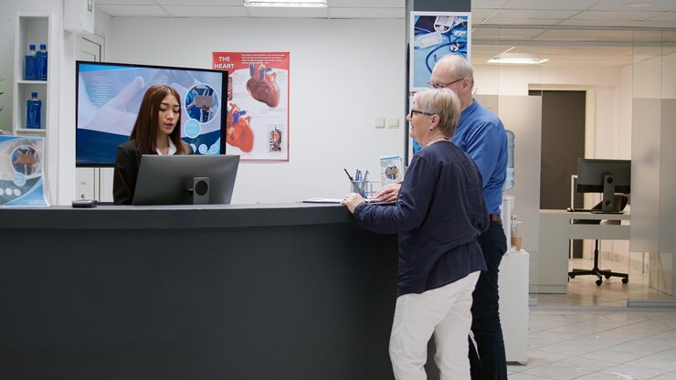
Give Visitors Instant Clarity with Interactive FAQs and Safety Info
Not every question needs a person to answer it. An interactive FAQ or safety info screen gives guests a clear way to pull up exactly what they need, on their terms, without delay.
This works especially well in buildings that receive contractors, vendors, or compliance-sensitive traffic. It helps everyone follow the rules without feeling policed.
Design the Screen Around Use Case
Start by defining who’s using the screen. For general visitors, focus on topics like:
- Wi-Fi access
- Restroom locations
- Parking validation
- Meeting room directions
- Host contact protocol
For vendors or contractors, include:
- PPE requirements
- Loading zone procedures
- Emergency contacts
- Badge pickup instructions
Build the content into an on-screen menu with large touch targets—minimum 48×48 dp for easy access. Keep interaction depth shallow. Limit the content to two taps max from start to answer.
Use Modular Content Blocks
Each FAQ or instruction should be modular—a self-contained text or graphic cards that load independently. Avoid scrolling interfaces. Use full-screen transitions between modules so the information is never cluttered. Each card should include:
- A clear header
- Short answer or directive
- Optional QR code for expanded mobile view
If a compliance officer needs to approve content, route each module through a version-controlled content pipeline. This ensures any legal updates get pushed live without redeploying the full signage setup.
Structure Safety Content for Visual Impact
For safety messaging, visuals matter more than verbosity. Use icon-driven formats that prioritize:
- Emergency exit maps
- Fire alarm locations
- Assembly point visuals
- Hazard symbols with labels (e.g., biohazard, electrical, restricted access)
Apply ANSI Z535-style formatting for safety colors—red for danger, yellow for caution, green for safe zones. Use sans-serif fonts in bold weight at a minimum of 24pt to meet readability standards.
In bilingual or international buildings, duplicate every screen in a secondary language using a toggle or auto-rotate system.
Upgrade Your Office Reception Signage in 2026
Your welcome area doesn’t need a full redesign to leave a better impression. A single well-placed reception screen with the right content can transform how visitors perceive your business from the moment they walk in. The ideas above work across industries, from corporate offices and law firms to medical practices and coworking spaces.
You’ve now got ten clear ways to pull more value out of your reception screens. Whether you’re managing foot traffic, showcasing recognition, or keeping visitors engaged while they wait, these tactics work because they’re built around clarity and intent.
Here’s a quick recap of what we covered:
- Digital welcome messages that greet visitors and answer key questions
- Branded motion loops that frame the room with purpose
- Live directories that guide guests without bottlenecks
- QR-led sign-ins that speed things up without touching a screen
- Social walls that make your internal culture visible
- Spotlight reels that show who trusts you and why
- Internal news feeds that keep staff plugged into what matters
- Visitor metrics that remove the guesswork from wait times
- Weather and traffic modules that help people plan their next step
- Interactive FAQs and safety digital signage content that empower visitors to self-serve
If you want office reception signage that’s easy to manage, looks professional, and works from day one without IT headaches, CrownTV’s turnkey solution is built for exactly this. Samsung commercial displays, the NEO media player, 200+ app integrations, and professional installation by licensed technicians, all included.
Related Reading: Planning signage for other areas too? See our waiting room display ideas for patient and client lounges, browse 31 digital signage examples across industries, or learn how real estate offices use digital signage to impress visitors.
Why Companies Choose CrownTV for Reception Signage
Choosing the right signage system means more than picking a screen. CrownTV delivers a complete office reception signage solution: commercial-grade Samsung displays, the proprietary NEO media player, a cloud dashboard with 200+ apps, and White Glove installation by licensed technicians in all 50 states. With 13,500+ active screens and a 5.0 Google Reviews rating, CrownTV takes your reception area from forgettable to impressive. Here’s what’s included:
- Full-scale planning from day one: Get hands-on support from kickoff to installation. CrownTV handles everything—site surveys, layout plans, and execution—with an eye on compliance, placement, and user flow. This makes it easier to align signage with office flow, conference rooms, and key visitor touchpoints.
- All-in-one setup, without the guesswork: From selecting the right indoor displays to mounting and configuring them, CrownTV delivers a turnkey setup that’s built around your space and your goals. This is especially useful for large office spaces that need unified control across multiple zones.
- A dashboard that keeps everything under control: Manage every screen across your reception and beyond using a secure, centralized digital signage software that works from any location or device.
- A player that never drops the ball: The CrownTV’s media player is compact, powerful, and consistent—built to run all types of content, all day, without lag or resets. Whether you’re showing health and wellness tips, safety protocols, or wayfinding modules, this player stays reliable.
- Integration with the tools you already use: From directories to calendars to social feeds, CrownTV connects your signage with the apps that matter—streamlining what’s shown and when. You can use it to display user-generated content, highlight company events, or promote success stories that build trust and recognition.
- Nationwide installation handled by pros: Certified technicians handle everything from hardware delivery to wiring, activation, and testing—no need to coordinate vendors across regions. This matters when you’re utilizing digital signage across multiple locations and want consistency from coast to coast.
- Support that doesn’t clock out: When questions or issues come up, CrownTV’s support team is there with fast solutions—whether it’s software updates or hardware checks. Their support is built to scale with your signage system and content strategy.
- 13+ years of proven signage experience: This isn’t new territory. CrownTV has spent over a decade refining what works, especially in high-visibility areas like reception zones, office signage, and interactive kiosks placed at guest entry points.
- AV strategy that matches your communication goals: Work with signage experts who know how to use motion, layout, and timing to move messages across digital screens in a way that actually gets read. Whether you’re sharing industry trends, pushing digital menu boards in café areas, or promoting upcoming events, CrownTV helps you do it with clarity.
- Smart ways to engage with mobile-first audiences: Use QR-based interactions to connect visitors’ mobile phones with your displays. Let them pull up interactive maps, navigate building layouts, or engage with digital notice boards tailored to their purpose of visit.
Ready to transform your reception area? Get a free consultation with CrownTV and discover how our turnkey digital signage solution can elevate your office welcome experience. From a single reception screen to a multi-location deployment, we handle everything so you can focus on what matters most: your business.