Your food truck might be parked in the right spot. Your prices might be dead-on. But if your menu doesn’t turn heads fast, none of it matters. We’ve all seen it—trucks that serve great food but can’t pull a lunch rush. Why? Because the menu looks like it hasn’t been kept up. It’s either hard to read, boring, or worse—forgettable.
Here’s the truth most won’t say out loud: Your menu sells your food before anyone takes a bite. And static boards don’t cut it anymore. Not in 2025. You need movement. You need clarity. You need to work your specials into the spotlight and switch them up without printing costs eating into your margins. Digital signage lets you do that—and more.
This article lays out 25 food truck menu ideas that work specifically for digital screens. Each one gives you something you can either run with or build on.
Stop Relying on Boring Menus — Start Working the Screen Like It Matters
Let’s start breaking those ideas down:
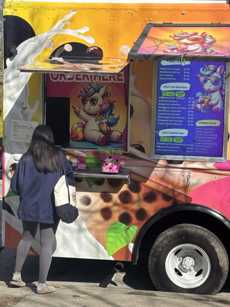
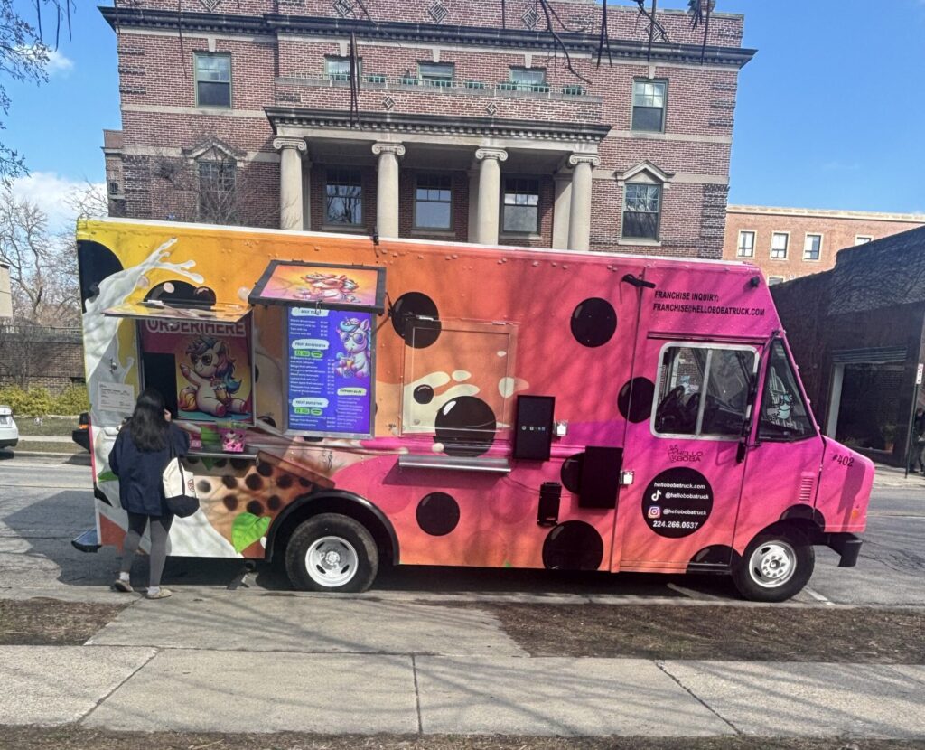
1. Eye-catching digital screen menu layouts that get noticed
Don’t just show your food—stage it. An eye-catching layout draws the eye before hunger even kicks in. That starts with contrast. Use dark backgrounds with bright font colors, or light templates with bold, saturated accents. Stick to one or two fonts max, and give each section breathing room.
Break the layout into clear blocks—headers, prices, images, and modifiers should never compete for space. Use grids, not guesswork. Keep high-profit items in the upper half of the screen and rotate them in larger text or with a visual edge like a border or subtle glow.
If a customer can’t scan the screen from 10 feet away and spot something crave-worthy, the layout needs work.
2. Bold category-based menu structures that guide hungry buyers fast
People scan menus like they scan headlines—fast and with purpose. Break the menu into bold, clearly labeled categories. Think: Burgers, Wraps, Fries, Drinks, Add-ons. Use icons or color cues to separate each section and prevent the screen from feeling like one long list.
Group similar items together so customers don’t have to hunt. If it takes more than three seconds to find where the fries live, the structure isn’t working. Stack high-margin categories near the top or middle of the layout. This setup works especially well for trucks with highly specialized menu formats—think wood-fired pizza, gourmet burgers, or regional smoked meats. It helps hungry customers spot what they want without slowing the line.
Plenty of new food trucks make the mistake of cramming everything onto one screen. But even at pop-up events or parked outside coffee shops, structure sells. Ask local food bloggers what makes a menu stand out, and you’ll hear the same thing: clarity, speed, and smart grouping. From cotton candy to cheese curds, every category deserves its own lane—especially when you’re working to highlight profitable food truck items in busy local events.
3. Seasonal and rotating menu ideas that keep foot traffic fresh
Static menus feel stale—even when the food isn’t. Introduce a rotating section on your screen that shifts weekly or monthly. It could be Summer Sliders in July or Loaded Chili Bowls in December. Use real-time content swaps to match the season without rewriting the entire board.
Highlight local produce in season. Feature flavors are tied to the current weather. And make the name catchy enough to stop someone walking by—“Fresh Off the Grill: August Edition” does more work than “Seasonal Specials.” Keep regulars curious. Give newcomers a reason to try the truck again.
4. Limited-time promos that push urgency without sounding desperate
Don’t beg for a sale—build urgency the smart way. Use the screen to push limited-time offers with a clear end date. Keep it subtle. A small countdown (“Ends Friday”) or a “Now Serving” highlight draws attention without screaming for it.
Flash deals for the last 30 minutes of service can clear inventory while boosting check size. Or rotate daily promos for slower time slots: “2-for-1 Wraps Before Noon.” Urgency works best when it doesn’t sound like a fire sale. Keep the tone confident and the deal specific.
5. Design ideas that help you cut through visual clutter
When parked among a row of trucks, your screen has three seconds to make an impression. Use whitespace. Avoid crowding every pixel. Build in visual hierarchy—big headers, medium descriptions, small extras. If your entire menu is the same size and color, nothing stands out.
Add short motion triggers like a flicker or shimmer that activate every 15 seconds to break the visual pattern without being obnoxious. Include one static anchor item—something that never moves—to ground the viewer’s focus.
Keep the visual load light and the focal points few.
6. Screen content pairings that match different food styles
What you serve should match how you show it. Street tacos need vibrant, fast-moving content. Smoked brisket deserves slower pans, moody color palettes, and weighty fonts. Smoothies? Bright colors, looping clips, and splash graphics. Think of your menu screen as part of your branding. Pair fonts, visuals, and animation style with the type of food you’re offering. Let the content echo the flavor profile. It sets the tone before the first bite.
If you’re testing unique food truck ideas like fusion dumplings, gourmet grilled cheese, or loaded mac bowls, your screen has to build appetite fast, especially at farmers markets or high-traffic events. Even a classic hot dog truck can stand out when the content plays up toppings, combos, or local twists.
Many food truck owners now treat digital signage like an extension of their mobile food service, not a downgrade from a brick-and-mortar location. It’s part of a growing strategy that ties into loyalty perks, food truck offers, and even syncing with an online ordering system. Done right, your screen doesn’t just show food—it sells it before they ever step in line.
7. Split-screen layouts to highlight combo deals
Combos move more food. Use your screen to move them faster. A split-screen format gives your regular menu one side and featured combos the other. Stack deals like “Burger + Fries + Drink” with price savings visible in bold. Keep this section on rotation, but anchor it in one screen location for consistency.
Make combo images slightly larger than standard menu items. Offer small upsells underneath—“Add cheese for 50¢” or “Make it spicy.” This structure helps undecided customers settle on a full meal instead of a single item.
This setup works especially well for ice cream truck operators or any mobile vendor who relies on visual sales triggers. In a fast-moving food truck scene, catching attention without slowing down the line is critical. If you’re working delicious food into a rotating set of combo visuals—like a classic grilled cheese sandwich paired with tomato soup or a pulled BBQ platter next to a house soda—you’re giving your screen real work to do.
Split-screen layouts also support different food truck concept styles without breaking your format. Whether you’re offering taco truck specials, regional Indian cuisine, or a modern twist on pulled pork, you can spotlight multiple categories side by side. In short, it’s a no-nonsense way to move more food with the same screen space—perfect for any food truck business serious about staying competitive in the evolving food truck industry.
8. Menu animation ideas that draw the eye without being annoying
Too much motion distracts. The right amount attracts.
Use animations to work highlights into view—text that fades in, price tags that pulse once every few seconds, or item photos that slide forward then snap back. Keep animations under 2 seconds and let them rest between cycles. Avoid constant movement. Instead, draw the eye in waves. Highlight one area, then pause. Let the screen breathe.
The goal isn’t to entertain. It’s to influence decision-making by pulling the focus where it matters.
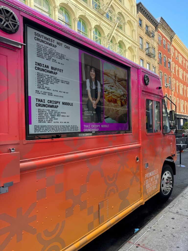
9. Ingredient spotlights for transparency and trust
People care about what’s in the food, especially when ordering fast. Use a rotating side panel or pop-up card to feature standout ingredients. Not every item needs a full breakdown, but popular sellers should have quick hits like:
- Local sourdough bun
- Grass-fed brisket
- House-made aioli
This isn’t a nutrition label—it’s a brag board. Make quality visible. Build trust by showing what you use and where you get it from.
10. Dietary callouts that save time and prevent order friction
Gluten-free. Vegan. Nut-free. Low-carb. Customers look for these words fast. Add small but clear icons next to each item. Use consistent placement—top-right corner, badge below the name, or a subtle overlay in a known color (green = vegan, blue = GF, etc.).
Give customers a shortcut. And train your screen to filter the options. It cuts down ordering time. It reduces mistakes. And it helps people feel taken care of.
11. QR menu pairings for mobile-friendly browsing
Not every customer wants to stand and read from a screen. Some prefer to scan, scroll, and decide on their own terms. Pair your digital signage with a clearly displayed QR code. Once scanned, the menu loads fast on mobile—same structure, same items, just more control.
Use QR menus to:
- Show full descriptions without cluttering the main screen
- Add photos for every dish
- Let customers browse before reaching the window
- Offer allergen filters and modifiers
Position the code in the lower corner of your signage, away from rotating content. It needs to stay visible no matter what’s playing.
12. Dynamic pricing ideas you can switch on the fly
Costs fluctuate. So should your pricing. Digital menus give you flexibility that printed boards can’t. Use it.
For example:
- Drop the price of overstocked items before closing
- Run flash sales for slow hours
- Test new pricing structures with zero printing cost
Make price changes subtle but effective. Avoid blinking or red text—trust fades fast when discounts feel forced. Instead, add a “Now” badge or a “Lunch Price” tag. Use the screen to adapt your strategy, not lock it in.
13. Weather-based menu triggers to match what people crave
The weather changes what people want. A hot soup might sell at 10 AM on a chilly morning, but sit untouched by noon on a warm day. Use your screen to push weather-matched items up front.
Here’s how to frame it:
- Cooler days → soups, grilled cheese, hot drinks
- Hot days → smoothies, cold wraps, salads
- Rainy weather → comfort food and warm baked items
Tie the food to the forecast, and move the screen content around that. It shows awareness. And it often bumps up impulse buys.
14. Local flavor sections that build loyalty fast
Familiar flavors build a connection. Use one section of your digital menu to rotate in local hits.
Feature:
- Regional sauces or spice blends
- Local bread or produce vendors
- Menu names inspired by the area (e.g., “The Brooklyn Melt”)
This isn’t about gimmicks—it’s about rooting your truck in the community. People support what feels close to home. And if you’re operating in multiple neighborhoods, rotate the content to match the local tastes.
A BBQ truck in San Francisco might showcase beef ribs with house slaw and caramelized onions, while a bright yellow truck near the marina leans into sunny visuals and refreshing desserts like rolled ice cream or ice cream sandwiches.
Use real customer feedback to guide what shows up in this section. When locals recognize the food—and feel seen in the menu—they come back. It’s not about following trends. It’s about tapping into the real eating habits of your neighborhood and aligning your menu with surrounding local businesses and health-conscious customers alike.
15. Menu countdowns for daily specials and end-of-day deals
Running a daily special? Countdown timers on your screen can make it feel more real and urgent.
Use it to show:
- Time remaining for lunch specials
- Units left of limited items
- End-of-day “final call” discounts
Make the countdown bold but not aggressive. A small timer bar or shrinking icon in the corner keeps it clean and effective. This tool pushes decision-making forward. No pushy text needed.
16. Holiday-based content swaps that keep your truck current
Seasonal relevance makes your truck feel alive, not frozen in time. Don’t rewrite your menu every holiday. Use the digital screen to swap in themed visuals, limited items, or small holiday shoutouts.
Examples:
- Valentine’s Day → heart icons, chocolate-themed desserts
- Fourth of July → red-white-blue combos, BBQ-heavy dishes
- Halloween → orange lighting overlays, spooky item names
This adds freshness without extra cost or design time. Set it up once and trigger it every year.
17. Time-based menu shifts (breakfast, lunch, late-night)
Your menu should move with the clock. Use time-based automation to shift the screen from breakfast to lunch to evening offers. You don’t need three menus—you need one that knows what time it is.
Structure it like this:
- Before 11 AM → breakfast sandwiches, coffee deals, light bites
- 11 AM – 4 PM → full menu, lunch combos, mid-day drinks
- 4 PM and later → comfort food, higher-calorie meals, shareables
Avoid overcomplicating. Customers should feel like your screen always shows what they want, when they want it.
18. Community shoutouts and social proof integrations
Let your regulars do the selling for you. Use one screen block to feature local faces, tagged social posts, or community shoutouts. This could include:
- A recent tweet about your food
- A reposted photo of a group ordering
- A short thank-you to a loyal customer
Social proof drives trust. And seeing real people on your screen helps passersby feel welcome, fast.
Keep the content real. No templates. No stock quotes. Let the truck feel alive.
19. Reviews and star ratings to show what’s popular
Decision fatigue is real. Don’t let people stand in front of your menu with a blank stare. Feature short, rotating reviews under your most popular dishes. Highlight what others liked, what they ordered, and why they’d return.
You can pull snippets from:
- Yelp
- Instagram DMs
- Text-based feedback
Add small star graphics or a “Top Rated” tag. These guide new buyers toward proven hits without making it feel scripted.
20. Upsell blocks for sides, drinks, or desserts
Your screen isn’t just for showing options—it can also build the average ticket. Design a lower-third section to rotate upsells. Keep it short. Keep it visual. Try this structure:
- “Add Fries +$2”
- “Try It With Our House-Made Slaw”
- “Dessert? Today’s Special: Banana Bread Pudding”
Don’t push everything at once. Rotate upsells every 10–15 seconds. Pair them with menu anchors for the best effect.
21. Loyalty offers and scan-to-save features
Loyalty programs don’t need plastic punch cards anymore. Show a “Scan to Save” offer on screen—QR codes that link to a loyalty sign-up, mobile coupon, or discount wallet.
Keep the screen copy tight:
- “Buy 9 Wraps, Get 1 Free”
- “Sign Up. Save $3 Next Visit.”
- “Scan & Stack Points Automatically”
This turns your screen into both a menu and a retention tool. No app download required.
22. Wait time displays paired with visuals to hold attention
If people are waiting, use the screen to hold them. Display estimated wait times next to loops of behind-the-scenes prep footage, food being plated, or your team in action. This builds transparency while keeping attention fixed.
Avoid countdowns that reset. Instead, offer realistic estimates like:
- “Current Wait: 6–8 Minutes”
- “Fresh orders rolling out every 2 mins”
When screens move with the queue, tension goes down, and customer satisfaction goes up.
23. Behind-the-scenes clips to boost trust and relatability
Let customers peek into the kitchen—without blocking your team. Show short video loops or stills of your process. Think:
- Chopping, prepping, grilling
- Final plating touches
- Staff loading the truck for the day
This adds humanity to the brand. It also signals confidence—you’re not hiding how things get made. Use this content in rotation when the truck isn’t slammed. It works best during longer waits or slower periods.
24. Cross-promos with nearby vendors or sister trucks
Alone? You sell food. Together? You create a destination. If you’re parked near coffee vendors, dessert carts, or sister brands, work a promo section into the menu. Feature bundle deals or scan-to-save offers that pair your food with theirs.
For example:
- “Pair Your Melt With Next-Door Espresso”
- “$2 Off If You Try Both Trucks”
Use visuals from both sides. Rotate the content every 20 seconds max. Cross-promotion should feel effortless, not forced.
25. Menu boards that actually get people to place bigger orders
The best digital menu boards don’t show more options—they lead people to better orders. That means:
- Placing high-margin items in prime zones
- Using smart pairings to suggest bigger meals
- Removing decision friction by trimming unneeded options
- Highlighting popular or profitable bundles
- Making upgrades (larger size, added protein, sauces) visible and fast to spot
A good board guides behavior without pushing it. It increases spending by removing confusion and spotlighting value.
Serving Smarter in Food Truck Business Starts With the Right Menu Ideas
Work the screen right, and you won’t need to shout your food’s value. You’ll show it. Menus that adapt to the hour, shift with the weather, and highlight the right dishes at the right time don’t just get noticed—they sell more food, faster. Customers decide quicker. Orders get bigger. Loyalty grows with less effort.
The real win? You spend less time making tweaks and more time pushing food out the window. Use digital signage well, and you:
- Speed up lines without rushing the customer
- Keep your menu fresh without reprinting a thing
- Push high-margin items without being pushy
- Respond to weather, demand, or slowdowns in real time
- Run smarter promotions that fill in the slow hours
And all of that becomes manageable when the tech behind your screen is built for it.
CrownTV makes those results achievable. Its central dashboard gives you full control over every screen, every shift, every menu change. Its media player powers smooth content playback—even with heavy rotations and dynamic pricing. And with turnkey installation, the setup works the first time, without dragging your team into it.Great menus make better trucks. CrownTV helps you build the kind that sells on sight.