In this guide, we explore everything you need to know about 10 digital signage mistakes and how it can transform your business communications.
Bad digital signage doesn’t just look sloppy. It quietly erodes trust, wastes money, and pushes people away. Most brands assume a bigger screen or fancier graphics will fix the problem. It won’t. Design mistakes don’t scream for attention—they slowly kill engagement behind the scenes.
This article calls them out. We’ll break down 10 design fails that weaken your message, dull your visuals, and make audiences tune out. No theory. No fluff. Practical mistakes you can spot—and fix—today.
Here’s what we’ll cover:
- Overcrowded layouts that confuse instead of inform
- Colors and contrast choices that kill readability
- Font blunders that strain the eyes
- Images and videos stretched beyond recognition
- Motion effects that distract rather than guide
- Calls-to-action are buried where no one looks
- Inconsistent branding that weakens identity
- Content timing that misses peak attention windows
- Poor screen placement is sabotaging visibility
- Ignoring accessibility needs altogether
Read on if you want your screens to work—not work against you.
10 Digital Signage Mistakes: Overcrowded Layouts Confuse and Dilute Messaging
Too much content on one screen is like five people talking at once—no one gets heard. A cluttered layout overwhelms viewers, hides the main point, and lowers engagement fast.
Why This Mistake Happens
- Teams try to cram multiple offers, updates, and visuals into one display.
- There’s no content hierarchy, so everything fights for attention.
- Designers believe more information equals more impact—but it rarely works that way.
The Damage Overcrowding Causes
- Critical messages get buried in visual noise.
- Audiences experience mental fatigue and stop paying attention.
- The brand looks disorganized and less credible.
How to Avoid Layout Overload
- Focus on one key message per screen whenever possible.
- Use white space strategically—it frames content and improves clarity.
- Define a clear hierarchy: headline, supporting text, visual, call-to-action.
- Balance visuals with breathing room between elements.
- Test layouts from the viewer’s perspective—trim anything that feels busy.
A streamlined layout doesn’t feel empty—it feels intentional.
Colors and Contrast Choices That Kill Readability
Poor color and contrast decisions do more than make digital signs hard to read. They change how people feel about the message, and the target audience quickly tunes out. Digital signage relies on speed—viewers glance for seconds. If design elements clash or text fades into the background, the message gets lost instantly.
Why This Mistake Happens
- Designers choose colors based on aesthetics rather than legibility.
- Brand guidelines lock teams into palettes that hurt brand consistency on screens.
- Brightness levels look fine on a laptop, but fail in different surrounding environment conditions, like glare or low light conditions.
The Impact on Customer Perception
Bad contrast doesn’t just block information—it affects how customers judge professionalism. Viewers subconsciously associate poor readability with low-quality materials or poor visibility, lowering trust in the message. Harsh color choices also lengthen perceived wait times in areas like lobbies or retail stores, making people disengage faster.
How to Fix Color and Contrast Issues
- Design tips recommend testing text and background combinations under various viewing angles and traffic patterns.
- Stick to high-contrast pairs for headlines and calls-to-action to highlight key benefits effectively.
- Use brand colors strategically—reserve them for accents, not full backgrounds or static visuals.
- Apply accessibility tools to check contrast ratios and content strategy for different business hours or audience flows.
- Keep palettes simple: two to three main colors with neutral backgrounds and proper negative space reduce the risk of costly replacements later.
Readable screens earn attention—and keep it—because they respect the viewer’s experience while placing signs intelligently for effective signage results.
Font Blunders That Strain the Eyes
Fonts carry more weight than most people realize. A hard-to-read typeface or inconsistent sizing ranks among the common mistakes that make even well-designed content feel sloppy. Digital signage gives you only seconds to communicate a message—unfriendly fonts waste that chance.
Why These Mistakes Happen
- Designers choose decorative fonts that look stylish but lack clarity on screens.
- Inconsistent font sizes create uneven visual flow across slides or layouts.
- Text weight and spacing don’t scale properly for larger displays, especially when large fonts are required for distance viewing.
The Problems Caused by Poor Font Choices
- Viewers struggle to process information quickly, leading to frustration.
- Inconsistent typography reduces brand professionalism and visual harmony.
- Strained eyes lead to skipped messages, turning typography into one of the mistakes to avoid for effective signage.
How to Get Typography Right
- Stick to clean, sans-serif fonts like Arial, Helvetica, or Open Sans for easy readability.
- Set minimum size standards for headlines, subheads, and body text to capture the numerous benefits of clarity and visual hierarchy.
- Keep font weights consistent—avoid mixing too many bold, italic, and light variations.
- Test screens from different viewing distances before finalizing designs, ensuring content remains legible even on black screens or displays affected by glare.
- Limit the number of fonts to two at most: one for headlines, one for body text.
Typography may seem like a small detail, but it’s a crucial component of digital signage design—getting it right keeps attention where it belongs, on the message itself, not the mounting hardware around the screen or the font distracting from fresh content updates.
Images and Videos Stretched Beyond Recognition
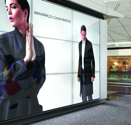
Distorted visuals instantly signal poor quality. Whether it’s a pixelated logo or a video stretched to fit a screen, the damage goes beyond aesthetics—it tells viewers the message wasn’t worth presenting properly.
Why This Mistake Happens
- Content teams repurpose assets made for social media or print without adapting them to screen dimensions.
- Designers rush to fill empty space, resizing visuals without keeping the original aspect ratio.
- There’s no standardized process for creating digital signage content in the right formats.
The Problems Caused by Distorted Visuals
- Blurry images reduce credibility and make brands look careless.
- Stretched videos distract viewers, pulling focus away from the actual message.
- Low-quality visuals suggest the entire content campaign lacks attention to detail.
How to Maintain Visual Quality
- Use high-resolution images and export videos in screen-specific dimensions.
- Keep aspect ratios locked when resizing content for different screens.
- Build a content library with pre-approved visuals formatted for digital signage use.
- Test visuals on the actual screen size before scheduling campaigns.
- Create design templates with fixed ratios to prevent distortion across layouts.
Crisp, correctly scaled visuals make every message feel professional and worth reading.
Motion Effects That Distract Rather Than Guide
Movement on a screen grabs attention fast—but not always in a good way. When motion effects serve style over purpose, they pull focus away from the message and make the entire display feel chaotic.
Why This Mistake Happens
- Designers overuse transitions and animations to make content feel “dynamic.”
- Multiple motion elements run at once with no clear visual hierarchy.
- No guidelines exist for speed, direction, or frequency of movement.
The Problems Created by Poor Motion Design
- Viewers get distracted by constant movement instead of reading the actual content.
- Fast or unpredictable effects create visual discomfort, leading to skipped messages.
- Overwhelming motion weakens professionalism, making the display feel less credible.
How to Use Motion Effectively
- Limit animation to highlight only key messages or calls to action.
- Keep movement predictable—smooth fades or simple slides work better than rapid spins or flashes.
- Use timing rules so animations don’t overlap or compete on the same screen.
- Test the entire content loop to see how motion flows from one message to the next.
- Prioritize clarity over creativity—motion should guide the eye, not fight for it.
Subtle, purposeful movement keeps attention where it belongs—on the message, not the effects.
Calls-To-Action Buried Where No One Looks
A digital signage campaign can have flawless visuals and perfect timing—but if the call-to-action hides in a corner or blends into the background, the effort falls flat. People glance at screens for seconds. If they can’t see what to do next, the message fails.
Common Placement and Design Mistakes
| Mistake Type | What Happens on Screen | Impact on Engagement |
| Bottom Corner Placement | CTA sits low where eyes rarely focus | Viewers never notice it |
| Weak Contrast | Button or text fades into background visuals | Action points go ignored |
| Overcrowded Context | CTA fights for space with multiple visuals | Message hierarchy collapses |
| No Motion or Highlight | CTA looks like regular text | Missed opportunity to guide the viewer |
Practical Fixes That Work
- Position CTAs near the center or along natural eye-flow patterns.
- Use high contrast between CTA elements and the background.
- Add subtle motion—like a pulse effect—to draw the eye without distracting.
- Keep wording direct and actionable with minimal text.
Calls-to-action should feel like the destination of the screen, not an afterthought hidden at the edges.
Inconsistent Branding That Weakens Identity
Digital signage works best when every screen feels like part of the same story. Mixing random colors, fonts, and visual styles across locations or campaigns erodes recognition. Viewers shouldn’t need to guess who the message comes from.
How Inconsistency Shows Up
| Branding Element | What Goes Wrong | Resulting Impact |
| Logo Usage | Cropped, resized, or swapped colors | The brand feels careless and unprofessional |
| Typography | Different fonts across campaigns | Weakens visual cohesion |
| Color Palette | Off-brand colors creep into designs | Recognition drops significantly |
| Tone and Voice | Mixed messaging styles across screens | Audiences lose trust in the brand voice |
Ways To Keep Branding Consistent
- Create digital signage templates for colors, fonts, and layouts.
- Standardize logo placement and sizing across all content types.
- Set clear tone and voice guidelines for headlines and CTAs.
- Audit existing content regularly to catch inconsistencies early.
Consistency doesn’t limit creativity—it ensures every message strengthens brand identity instead of chipping away at it.
Content Timing That Misses Peak Attention Windows

The right message at the wrong time is wasted effort. Digital signage isn’t about running content endlessly—it’s about syncing messages with the moments when viewers actually look.
Common Timing Mistakes in Digital Signage
Instead of a paragraph here, a visual timeline diagram would work best. It could show:
- Morning rush hours with low dwell time
- Midday breaks with higher engagement levels
- Evening windows for targeted messages
This gives readers a clear view of how poorly timed content can miss its audience entirely.
Smarter Scheduling Practices That Work
- Match content schedules to foot traffic and audience habits.
- Rotate campaigns frequently to avoid screen fatigue.
- Use shorter message cycles during peak viewing hours.
- Test multiple timing strategies to find the highest engagement windows.
Well-timed content doesn’t need longer screen time—it needs the right moment to make an impact.
Poor Screen Placement Sabotaging Visibility
Even the best-designed content fails if no one can see it properly. Screens hidden behind pillars, placed too high, or facing the wrong direction waste both money and message.
Placement Mistakes vs. Effective Positioning
| Screen Issue | Typical Outcome | Better Approach |
| Placed Too High | Viewers strain their necks, then ignore it | Align at average eye level for easy viewing |
| Behind Obstacles | Critical content blocked by walls or furniture | Keep sightlines clear from major pathways |
| Facing Away From Traffic | Minimal impressions from passing audiences | Angle screens toward main foot traffic flows |
| Overcrowded Screen Clusters | Competing visuals dilute attention | Space screens to avoid message interference |
Placement Practices That Improve Impact
- Perform on-site viewing tests before finalizing installation points.
- Map audience movement patterns to guide placement decisions.
- Use larger displays only where viewing distances require them.
- Avoid glare-heavy spots near windows or harsh lighting.
Strategic placement ensures screens work with the environment—not against it.
Ignoring Accessibility Needs Altogether
When accessibility gets overlooked, digital signage leaves out entire groups of viewers. The goal is to reach everyone—not just those with perfect vision, hearing, or mobility. Yet, accessibility often sits at the bottom of the design checklist, if it appears at all.
Where Accessibility Breaks Down
- Text size too small for people with visual impairments
- No subtitles or captions for video content
- Poor contrast levels that block legibility for color-blind viewers
- Interactive screens without touch-free alternatives
- Audio-only messages with no visual support
Accessibility Practices That Improve Reach
- Follow recognized guidelines like WCAG for digital content.
- Add captions to every video or dynamic content loop.
- Use voiceovers and text together for better inclusivity.
- Design interfaces for both touch and touch-free interactions.
- Audit signage regularly with accessibility tools and real users.
Building accessibility into signage design expands reach—and sends a clear message that every viewer matters.
Getting Help to Fix Digital Signage Mistakes
Fixing the common digital signage mistakes we’ve discussed—overcrowded layouts, low-contrast visuals, inconsistent branding, poor placement of screens, and other design failures—takes more than creative skill. These issues often stem from fragmented workflows, outdated tools, and ignoring local signage laws that affect installation and maximum visibility. Simply asking teams to do better rarely solves the problem.
Digital signage operates as a full system: digital signage screens, hardware, software, network connectivity, sign’s design, content scheduling, marketing efforts, and even proper lighting all contribute to success.
If one layer fails—whether it’s screen content timing or a sign’s visibility in high traffic areas—the entire experience suffers. Correcting these issues requires technology built for scale and a professional signage company with expertise in both creative execution and technical deployment.
This is where CrownTV stands out:
- Centralized Digital Signage Software – CrownTV’s dashboard helps maintain consistent branding, automate digital signage content mistakes prevention, and deliver a unified brand message across multiple locations. It even supports social media feeds for more visual interest and attracts potential customers with dynamic, visually appealing campaigns.
- High-Performance Digital Signage Players – Engineered to support outdoor signs, illuminated signs, and content-heavy networks with LED lighting, these players keep business signage running smoothly without glitches, delays, or low-resolution playback issues.
- Professional Implementation Services – From choosing durable materials to handling outdoor signage installations with the correct sign’s weight specifications and light background contrast, CrownTV ensures business visibility and brand visibility stay intact while boosting brand image and brand loyalty through flawless execution.
With CrownTV, businesses move past patchwork fixes into a system designed to ensure optimal visibility and maintain control over every digital screen—indoors or outdoors—without losing time, quality, or opportunities.
Turning Digital Signage into a Strategic Asset
Poor design choices weaken even the most expensive digital signage networks. Overcrowded screens, low-contrast visuals, misplaced calls-to-action, and inconsistent branding all chip away at engagement and brand credibility. Fixing these problems isn’t about chasing trends—it’s about building a signage strategy that combines strong creative execution with the right technology stack.
For businesses in the USA, CrownTV offers exactly that combination. With centralized dashboards for content control, high-performance media players for flawless playback, and professional implementation services for installation and ongoing support, CrownTV provides the infrastructure needed to prevent design errors before they cost time, money, and attention.Digital signage done right doesn’t just display content—it delivers impact. The brands that win are the ones that treat their screens as strategic communication tools, not just decorative tech. CrownTV makes that possible.